Project Overview
Date: May, 2024
Completion time: 2 weeks
Field: UX Design, UI Design
Work type: individual
In this project, I was tasked with designing a barter app that allows users to exchange goods and services without using money. After analyzing existing solutions, I decided to take a different approach.
Instead of creating another search tool-based solution, I introduced match-making mechanics to ensure users remain engaged with the app, addressing one of the key business requirements.
The Minimal Value Proposition was formulated based on desk research and business requirements.
Then, a User Flow was created in line with the MVP. The solution was validated through user tests using Low Fidelity Wireframes, quickly made in UIzard.
The final UI design utilized vibrant, energizing yellow while maintaining a sense of simplicity.
AI tools expedited the research process and enabled rapid wireframing.
Business Requirements
The client's brief prioritized keeping users engaged with the app and gamifying the experience. Integrating virtual currency was essential, as the service was intended to be 100% cashless.
Desk Research
The competitor UX analysis focused on listing services like Craigslist, with a thorough examination of the Barterway app due to its proximity to cashless transactions. Barterway, like other apps, relies on a search-based approach, which is not very intuitive. Its cluttered interface complicates navigation, offering few filtering options and unnecessarily splitting certain functionalities into separate segments.
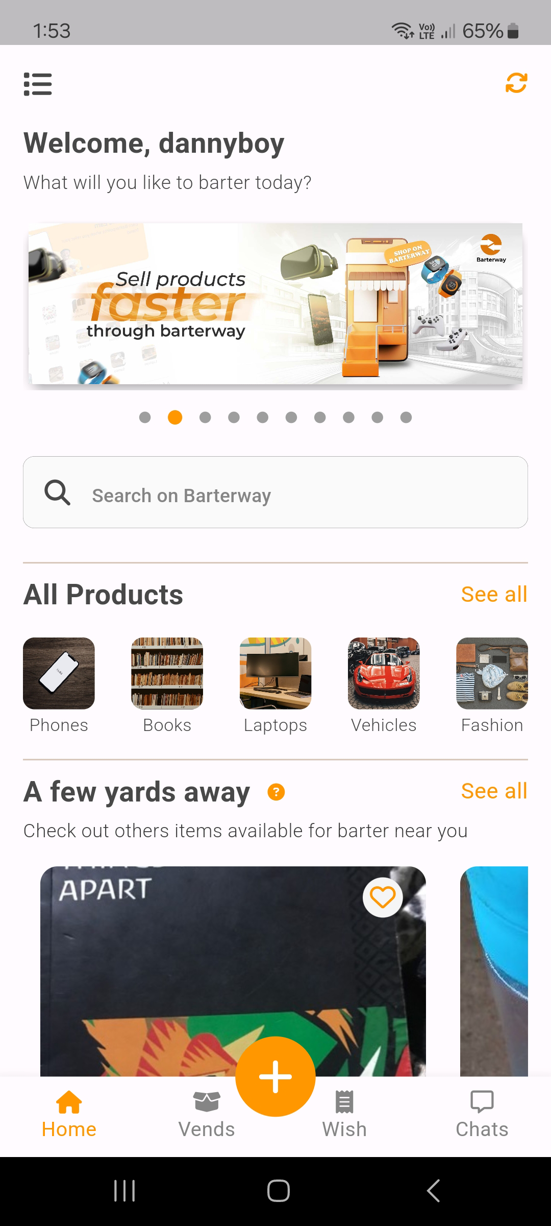
barterway app screenshot
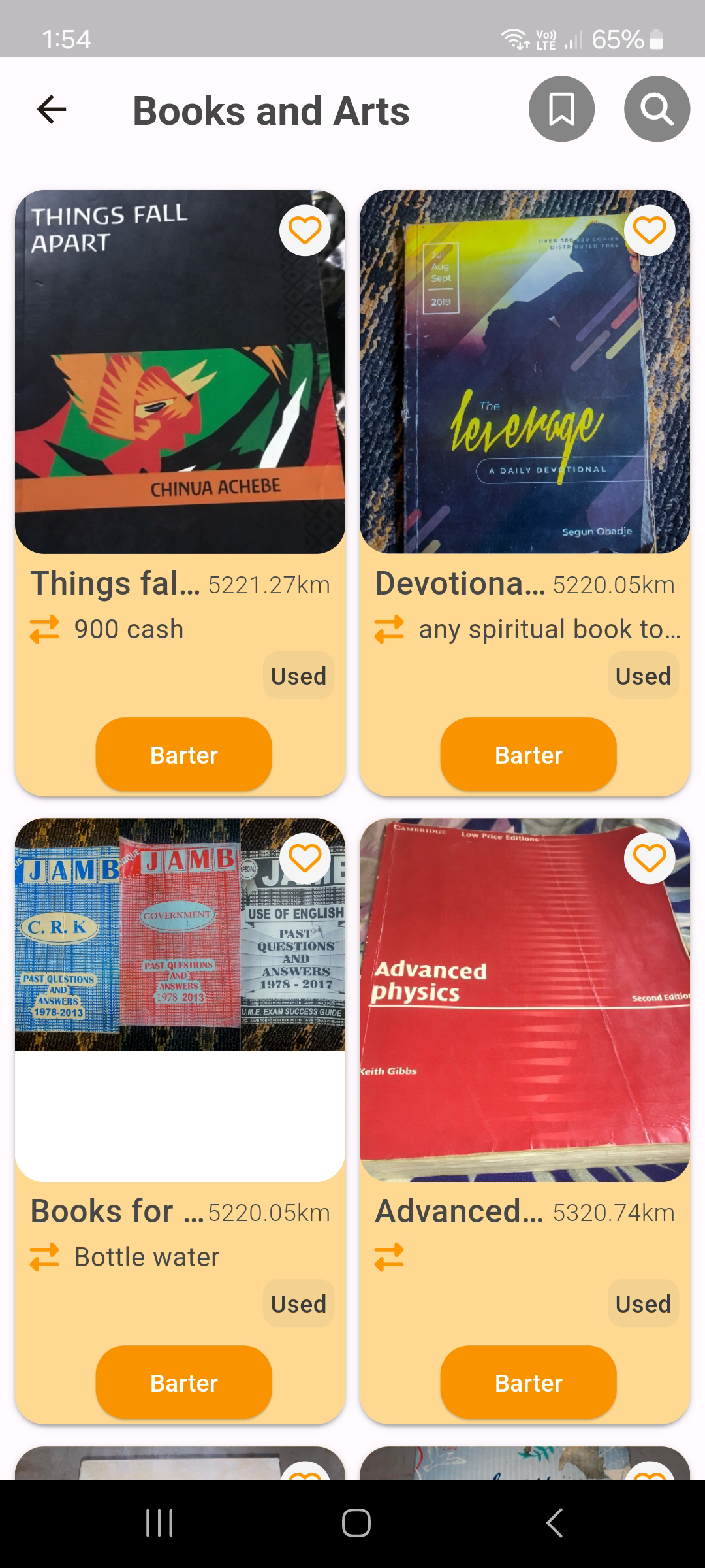
barterway app screenshot
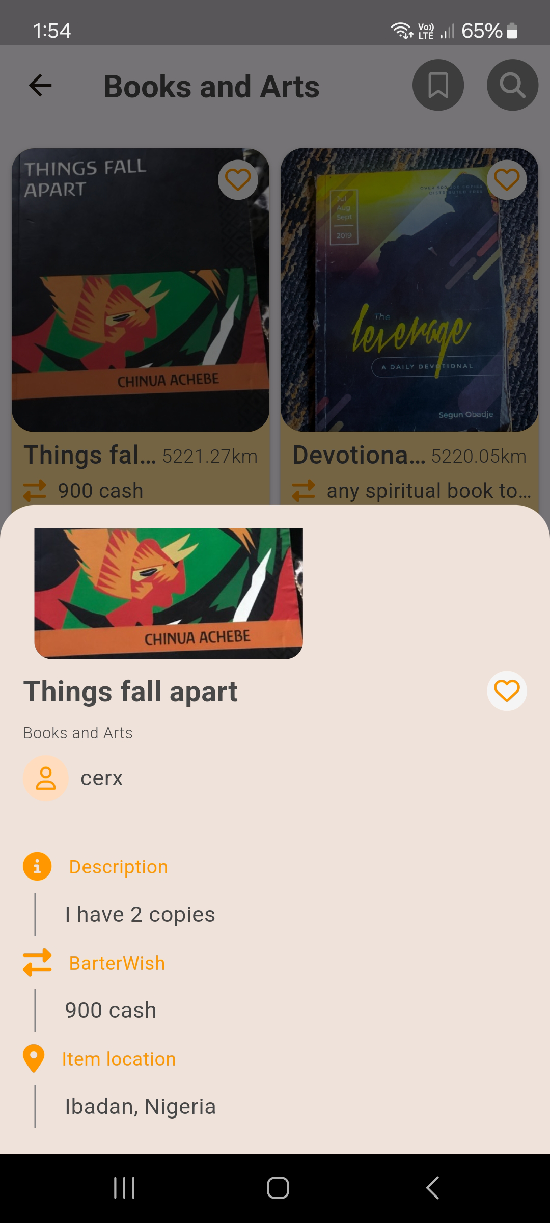
barterway app screenshot
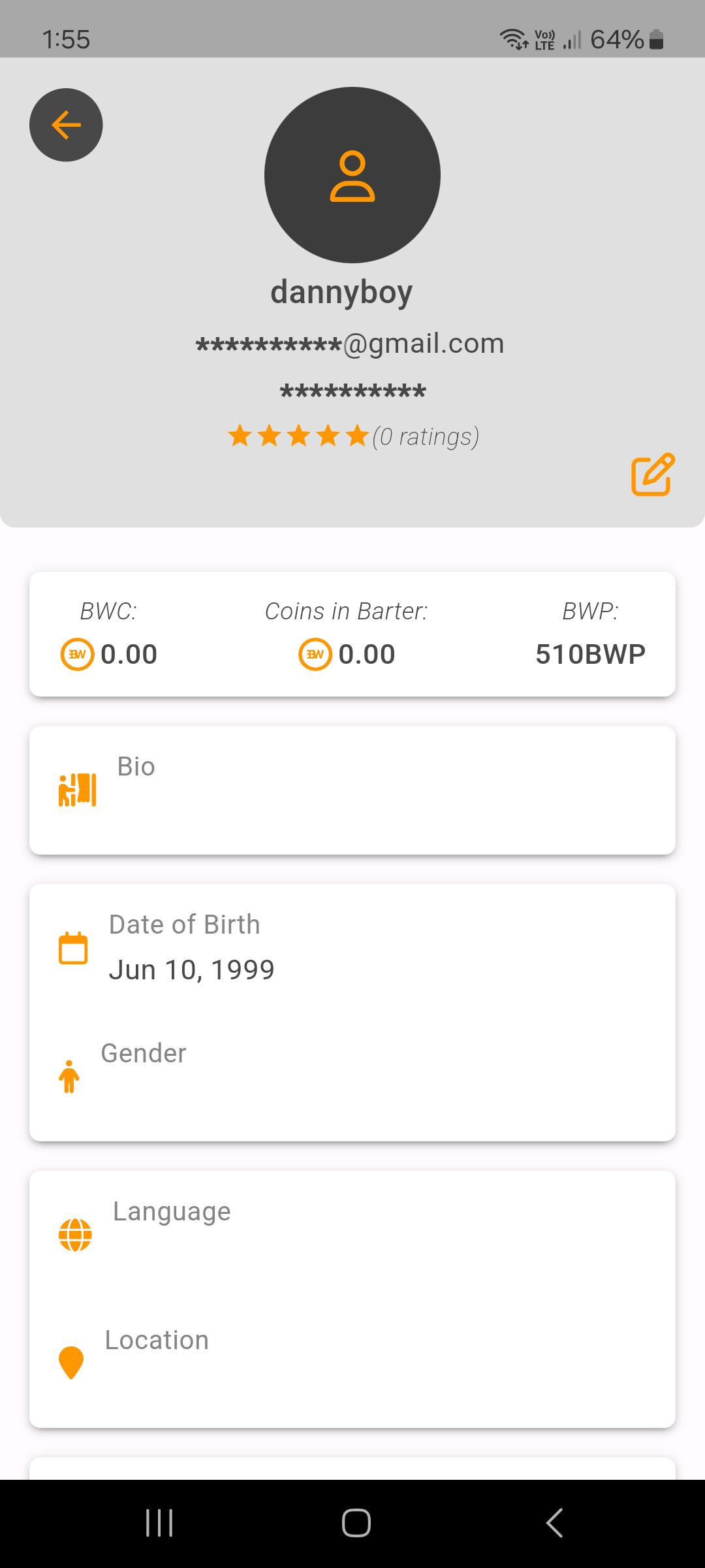
barterway app screenshot
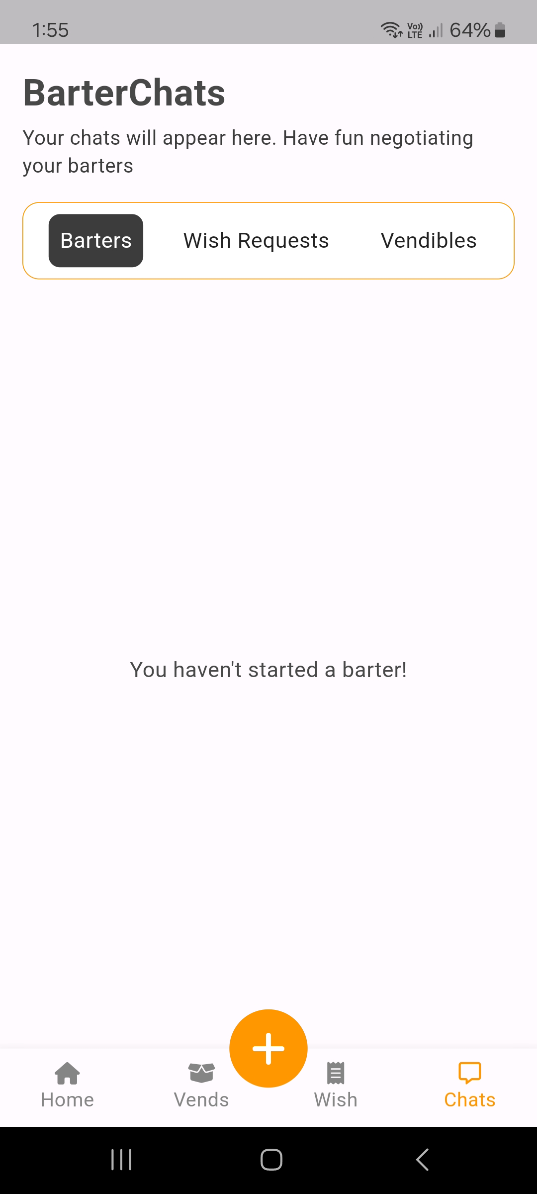
barterway app screenshot
User Flow
The formulated Minimal Value Proposition is reflected in the constructed User Flow, illustrating the mechanics of registration, logging in, match-making, and finalizing offers. The category search is integrated with filters to ensure a seamless flow while browsing listings.
Low Fidelity Wireframes
Low-fidelity wireframes prioritize layout and structure, allowing quick exploration and iteration of the solution. This approach paves the way to achieve a simple, clean, and intuitive design.
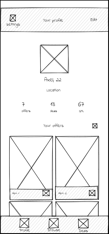
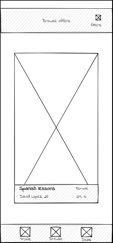
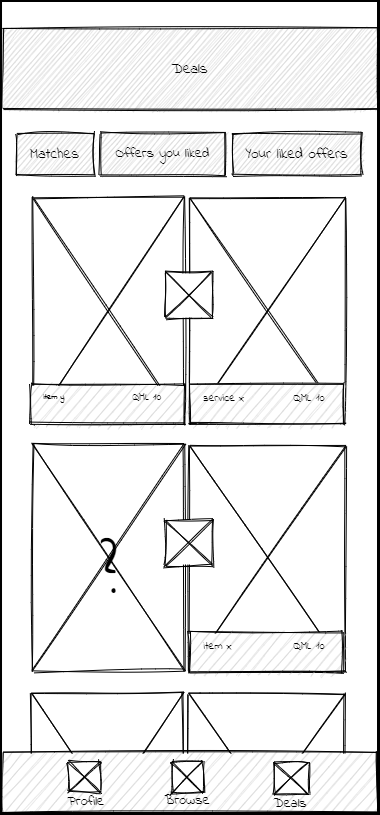
User Tests
Testing on low fidelity wireframes proved to be not only cost and time effective, but also provided invalueable feedback into designing a user-friendly interface.
UI Design
The design explores the common ground between iOS GUI's minimalist aesthetic and consistent spacing, and Material Design's bold colors and grid layouts, to create a cohesive experience across both platforms.
Each system's trademark navigation styles and features are retained.
The Android version, for example, introduces a navigation sidebar and a floating button, enhancing usability and adhering to Material Design principles.
UI Prototype
The interactive UI prototype serves as a tool to showcase the solution and further test its functionality.
